
Marketer.com
A growth operation for commerce brands.

Marketer.com makes the ads, runs them and proves they work. We built its brand on one line from its own playbook: AI carries the volume, humans own the creativity.
The idea
It starts with the dot
The dot is Marketer. Zoom out and there are many dots: the data. Zoom out again and the dots turn to grain, the human touch.


Identity
A dot and two strokes
The symbol is an M drawn from a dot and two strokes. With the wordmark it makes the lockup; on its own it is the app icon and the avatar. The dot in .com is mint.



Colour
Mostly cream
Cream carries the brand. The greens run from a whisper to Marketer Green, with a deep green for text and black when it needs to be loud.
- Cream#FFFEFB
- Bg Green#F0F6F2
- Light Green#D0EBD8
- Hover Green#C1E6CC
- Marketer Green#60C686
- Text Green#18643A
- Black#000000
Type
One typeface
Roobert Pro. Medium sets the headlines, Regular sets everything else.
Imagery
Beyond real
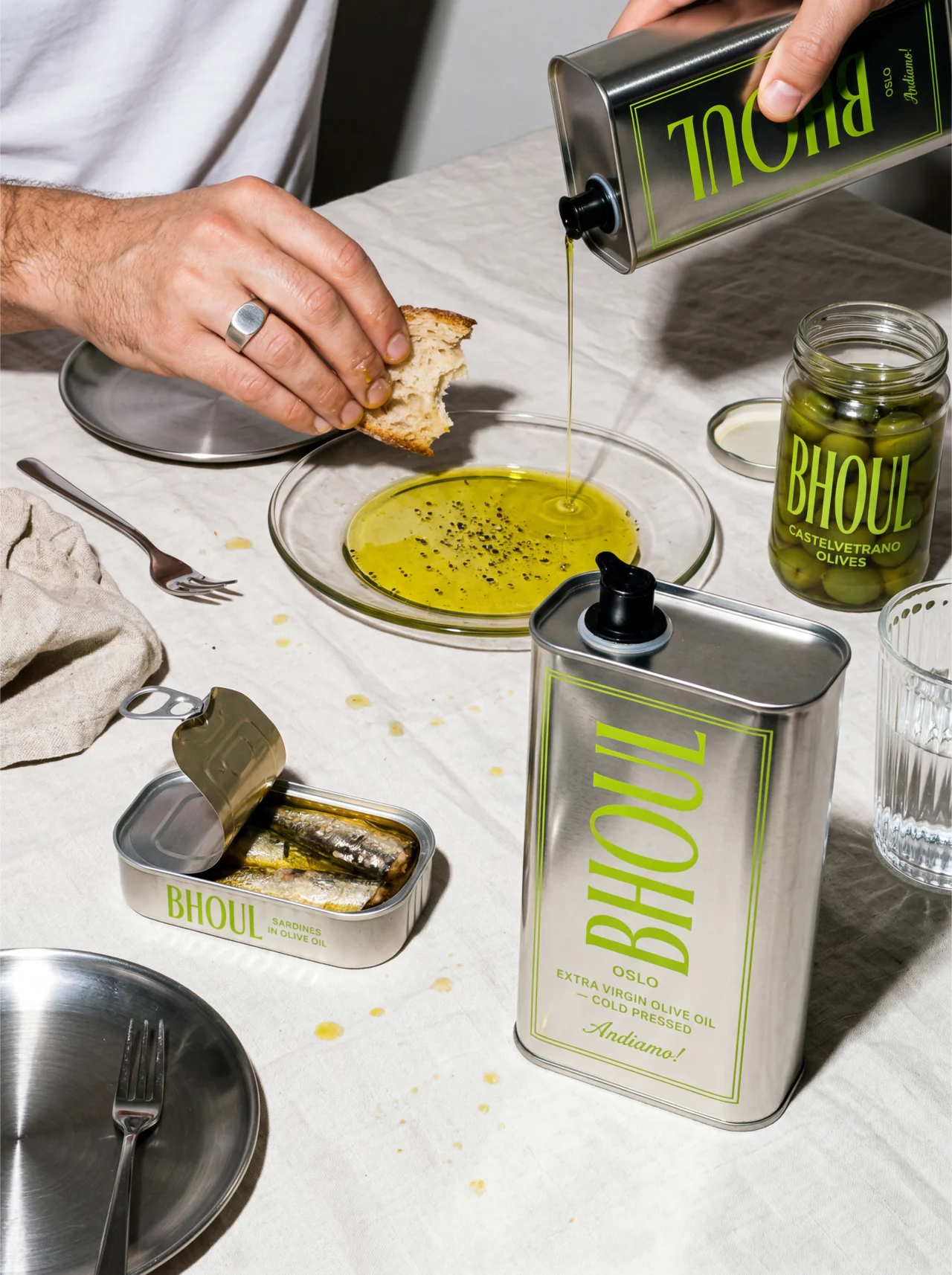
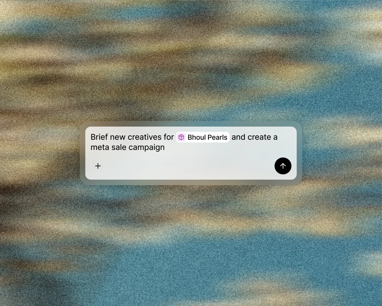
Every image has to look photographed, even when the scene could never happen. Grain on every image, graded like Kodak Portra 400.





In use
Eight ad families
Every ad belongs to one of eight families, from Intelligence to Human touch. The same system runs through the ads, the feed and the product.




Short sentences. Numbers instead of adjectives. Outcome over features.