Eiendom.no
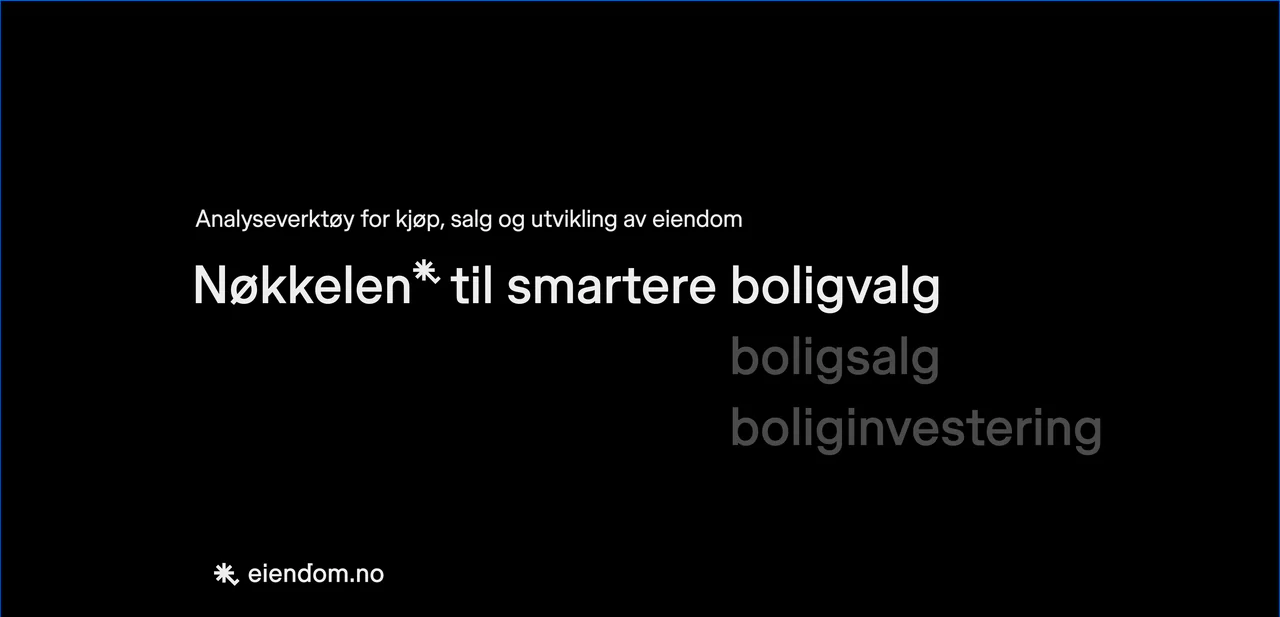
The key to smarter home choices.
Eiendom.no helps people buy, sell and develop property. The brand had to read as an analysis tool, not a lifestyle magazine: the objective voice between you, the broker and the market.
The idea
Not another house
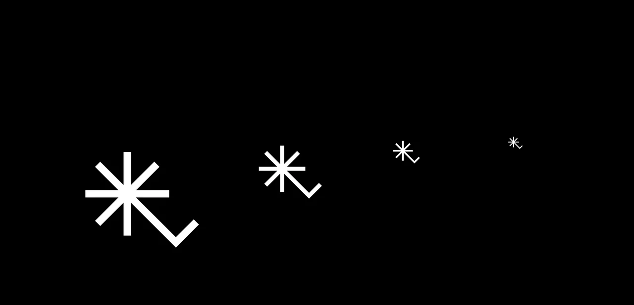
Property brands draw houses, and apartments don’t have five corners. So the symbol is a key: access to what sits behind closed doors. Look again and it is a star for a rating, an asterisk for insight and a tick for approved.
Identity
Simple at any size
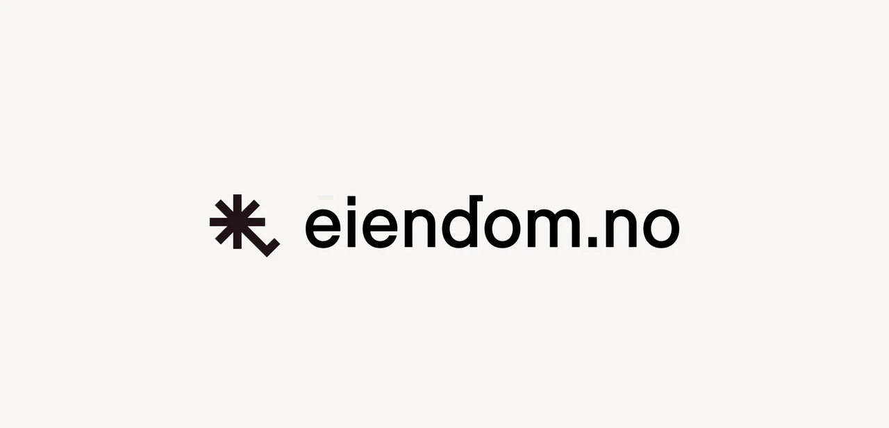
Symbol and wordmark work together or apart, and hold up at the smallest sizes. There is a small key in the d.
Colour
Colour means something
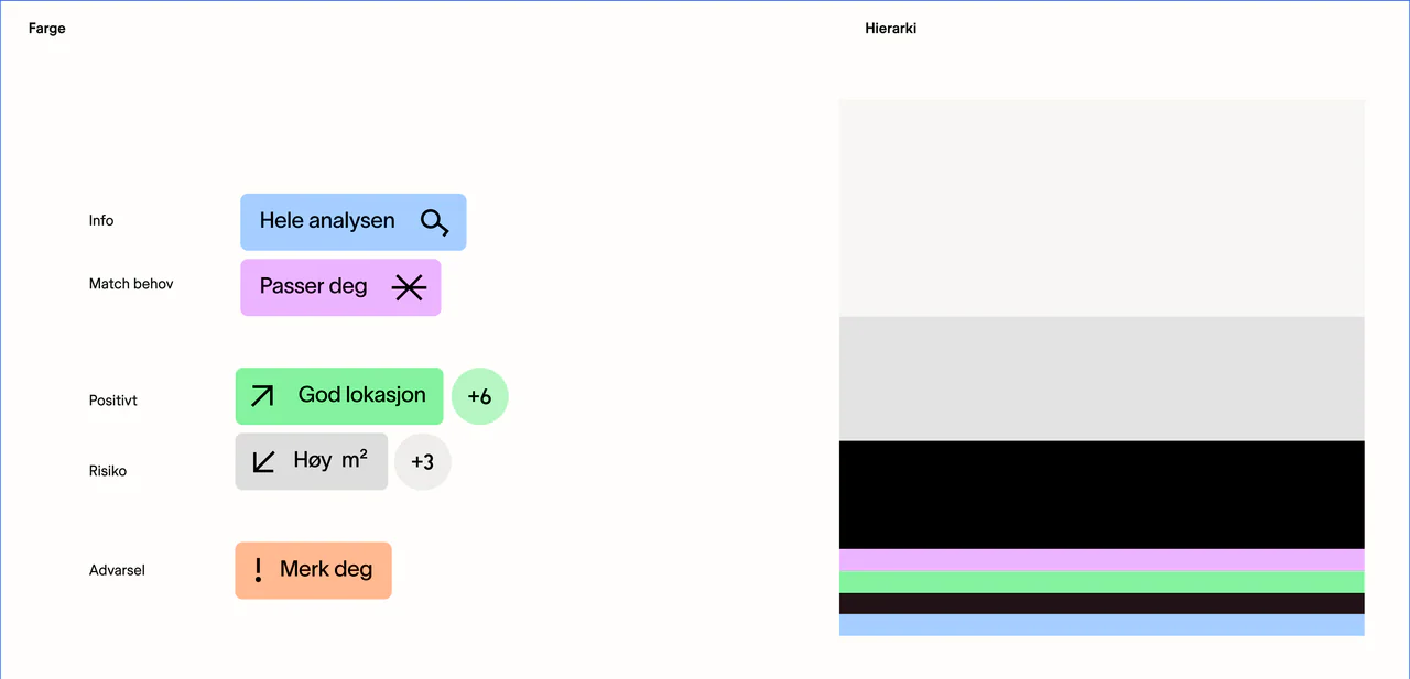
Colour is never decoration. Blue is information, green is good news, orange is a warning and lilac is a match, all on warm neutrals.
- Off-white#F7F6F5
- Light grey#E4E3E3
- Aubergine#211317
- Black#000000
- Information#A6CEFF
- Good news#85F29F
- Warning#FFB991
- Match#ECB4FF
Type and icons
Parts of one system
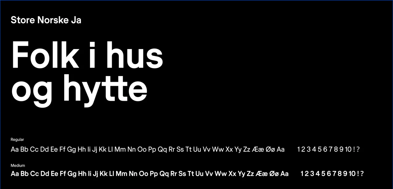
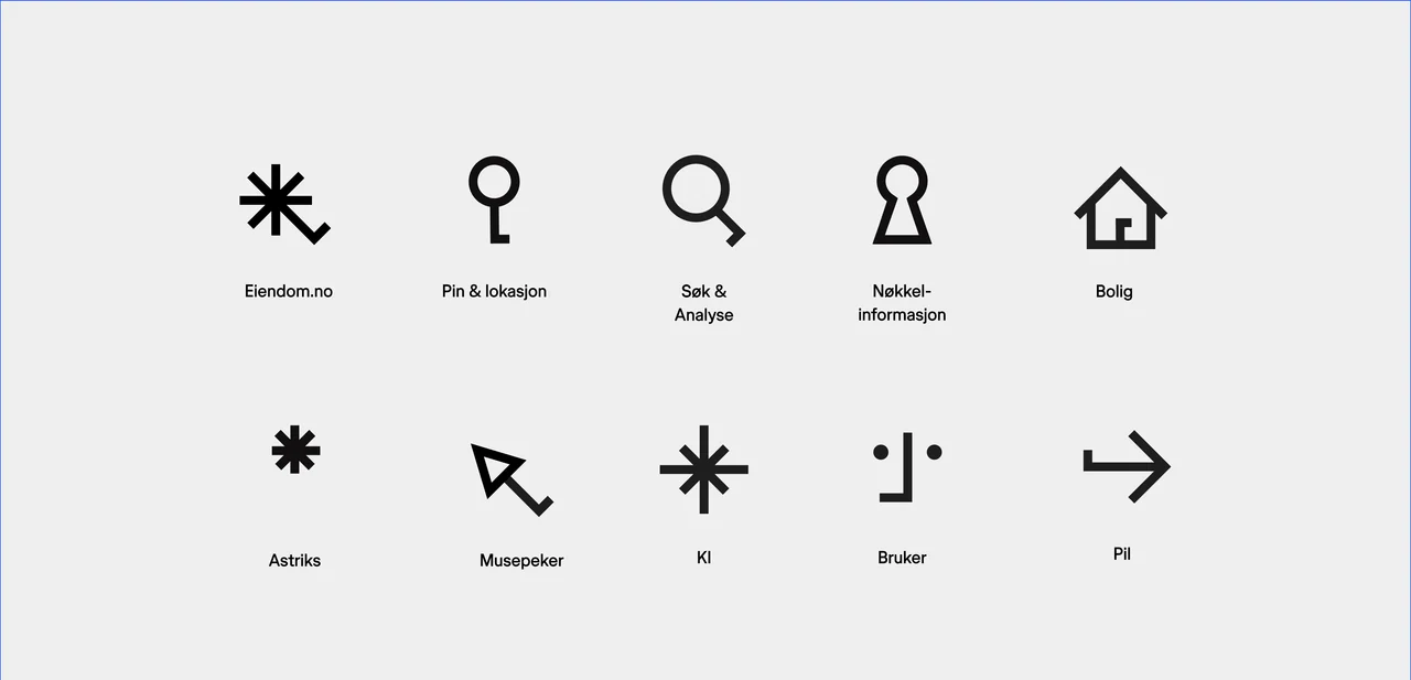
One typeface, Store Norske Ja, from Book to Medium. The icons are parts of the same system, from the map pin to the keyhole.
Voice
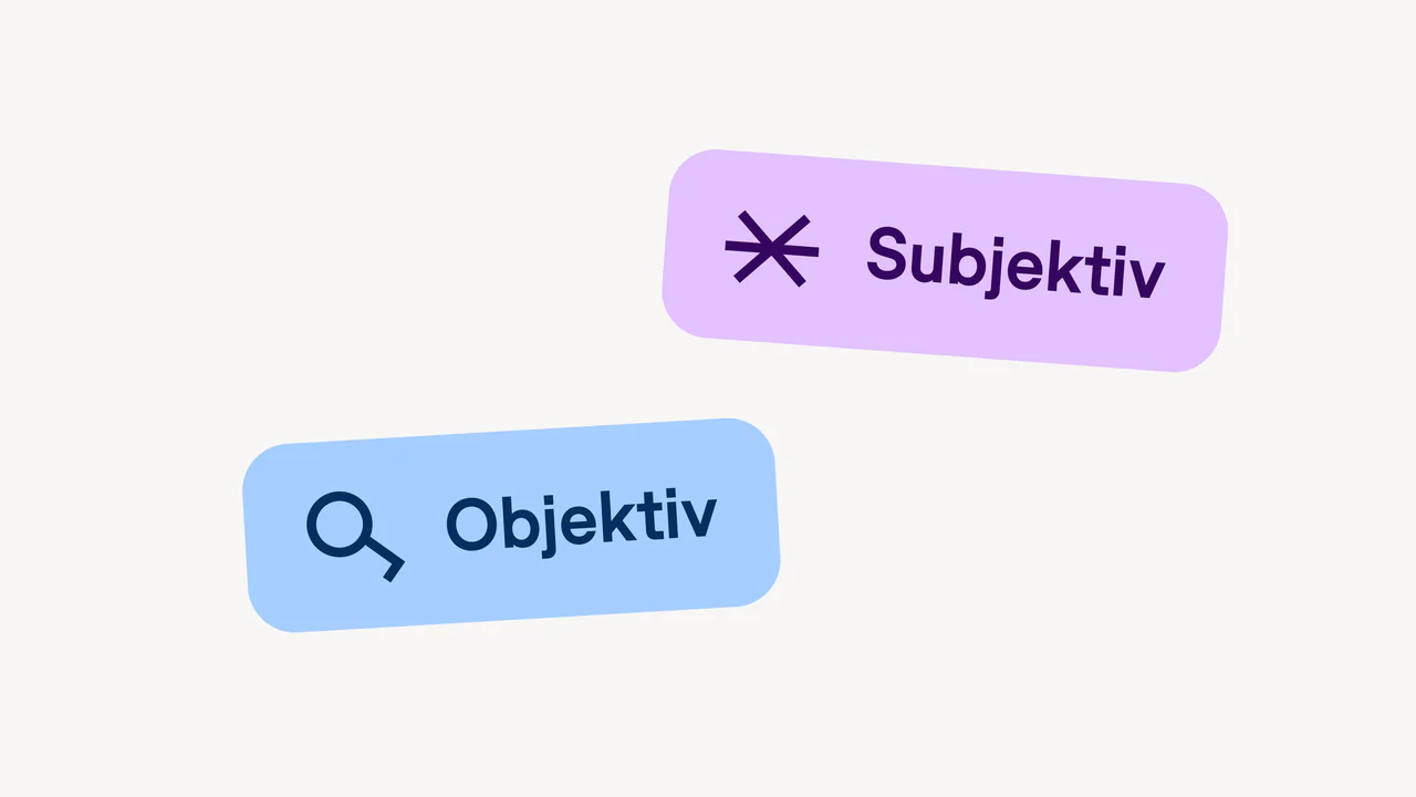
Objective, on purpose
The objective voice between you, the broker and the market.
Product
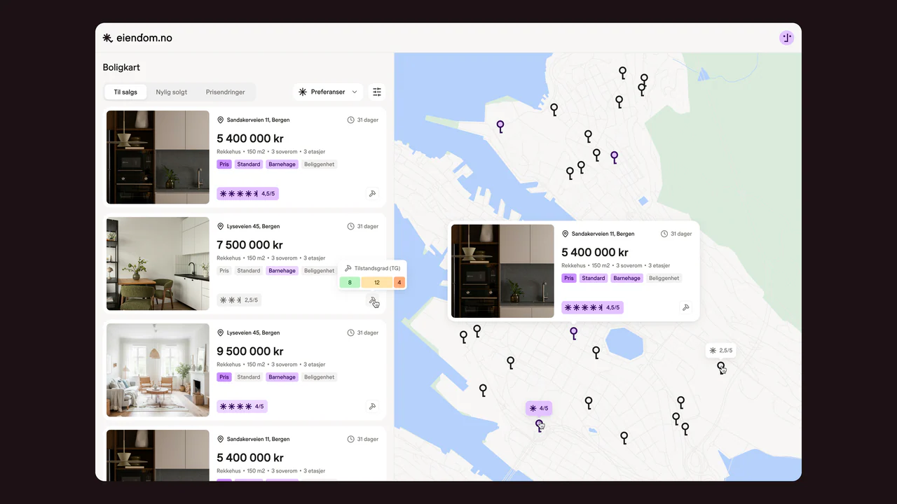
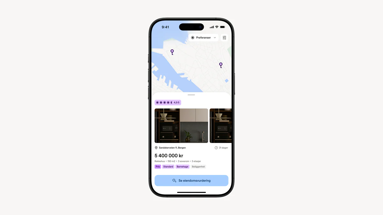
The brand proves itself in the product
Maps, lists and valuations carry the identity, so trust is earned where the decision is made. These are concept screens from the second round; the product design comes next.